How to customise your shop's layout and style #
The Global styles section allows you to personalise your shop for a unique and professional look. In this guide, we walk through the features you can use to achieve this.
Step-by-step guide #
1. Navigate to Global styles
- From the admin dashboard, select ‘Website builder’
- A new tab will open with the Website builder
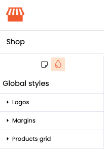
- Find and click on the paint drop icon (located near the top left) to access Global styles
2. Customise your shop
Below we run through each feature of Global styles and what it is used for.
Logos
- Site logo: This logo will appear in the header of your website and shop and on your dashboard.
- Invoice logo: This logo will appear in the invoice PDF and any emails sent to the customer. Upload a logo that can be seen on a white background.
- Browser icon (Favicon): This icon will appear in the tab of your browser (max size: 200px x 200px).
- Supported file formats for logos: .jpeg, .jpg, .png, .gif, .webp.
Margins
The default site width is 100% of your browser width. Adjust the widths of your header, shop, content and footer to achieved your desired layout.
Products grid
You can choose to display your products in your shop in Masonry or Tile boxes:
- Masonry: Masonry boxes will adjust the height based on the content
- Tile: Tile boxes are of equal height and width
Here, you can also choose how many products to appear in each row in your store.
Font and colours
Select your site font, background colour, text colour and link colour.
Navigation
Customise the navigation menus (Header, Footer, Utility Section and Categories) with your brand colours and ensure customers can easily find what they’re looking for.
Buttons
Style buttons to match your site’s design, making them visually appealing and consistent.
Custom CSS
If you have knowledge of CSS, you can add custom styles to further personalise your shop’s appearance.
3. Save and Publish your changes
- Once you’ve made your changes, don’t forget to click the ‘Save’ button at the bottom of the ‘Global Styles’ section to apply these
- Click the ‘Publish’ button on the top right of the screen to publish your changes to your store
- Alternatively, if you’re not ready for your store to go live yet, click ‘Save draft’ on the top right
Tips #
- Consistency is key – use similar design elements across all areas for a cohesive brand identity
- Make sure your image files are in the correct format to avoid any upload issues
- Click on the Help icon if you need further assistance
Make your Little Big Shop on point, by personalising its layout and style! #
For more ideas on branding, check out the pages below:


